Previewing body text
Find out how a font looks in a book, magazine or website article.
Text layouts
Typeface’s main grid is great for determining which font you’d like to use in your logo design, video title, business card or overall branding. By entering custom preview text you can preview any words you want, which gives you a nice first impression of the characteristics of your fonts. But a beautiful display font used in a logo may not always be the best choice for longer body texts.
A display font is often used to grab attention. It may have a strong personality with unique shapes. For body texts you probably want something easier on the eyes, something that stays readable at smaller sizes. Legibility is more important for these fonts than expressiveness.
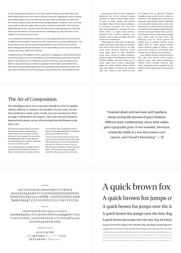
The detail tab allows you to preview your fonts in body texts, so you can get an impression of how a font looks in larger chunks of text. There are several layout presets available for different situations: book, columns, magazine, quote, characters and waterfall. Use the buttons at the bottom of the app window to switch between them.
Adjusting size and line height
Each preset has a predefined font size and line spacing. Not every font is the same size, so it’s important to be able to quickly adjust the size to see what works for a particular font. You can click and drag your mouse horizontally to adjust the font size. Drag vertically to change the line height. Alternatively pinch on your trackpad to adjust font size and hold the Option key while pinching to change line height.
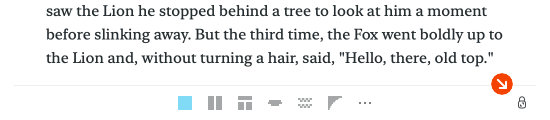
The button placed on the left side of each block of text shows the point size for that block. When you hold down the Option key it toggles to show the line height multiplier. Click the button to edit the properties of that block, such as tracking, alignment and paragraph spacing.
Font smoothing
Some fonts may be a bit too thin on smaller sizes, which makes them hard to read. You can enable > to make them appear bolder. Font smoothing reduces jagged edges when rendering fonts, it’s a kind of anti-aliasing.
Note that for some fonts that have a lot of detail this may have the inverse effect and make the fonts harder to read on smaller sizes. Similarly, the result may differ for dark text on light backgrounds and light text on black backgrounds. So experiment and toggle the setting to see if it helps (or breaks) a specific font. You can use the keyboard shortcut OptionS to quickly enable or disable font smoothing.
Most design applications should also have a similar toggle to apply font smoothing.
If they implement custom font rendering the effect might be more pronounced or less noticeable depending on the implementation.
For web browsers you can experiment with the font-smooth CSS property, or the -webkit-font-smoothing property for Safari.
Layout width
To optimize readability you’ll have to consider the length of lines when creating body text. Too few characters and you’ll have to frequently jump from the end to the beginning of the next line, causing excessive eye movement. Too many words and the text may become overwhelming, it becomes difficult to continue reading a line. Both may exhaust the reader.
Therefore Typeface caps the width of text layouts to a certain maximum. When you resize the app window you’ll notice that the text layout stays at a max width. You can unlock the width by clicking on the lock icon in the bottom right corner of the window. When unlocked you can resize the window and the body text layout will follow the window width.
If you’ve found a width you like you can click on the lock button again to lock the width. This will set the max width of the layout at the current width. If you resize the window you’ll notice that the layout will not exceed the locked width. However, when making the window smaller the text layout will always decrease to fit the available space.
Pairing fonts and viewing multiple layouts
The detail text tab shows a single layout for a single font. This layout can be opened in a separate window such that it can be compared with other layouts or fonts. For example you may open a second layout to compare legibility of two fonts side by side.

Click on the new window button at the bottom right to open the current layout in a new panel, or press CommandK. This opens a Pairing Studio, which supports setting a different font for each text block. If you want to focus on the text layout choose > from the main menu or press Command/ to hide the sidebar.
You can open multiple panels, mix and match font combinations and edit your layouts. Learn more about pairing fonts
Printing and PDF export
Designing for print? There may be subtle differences between fonts displayed on screen and fonts printed to paper. Ink may bleed, font sizes may differ — the best way to determine if a font looks good on paper is to print it. Printing your layout is available from a Pairing Studio.
- Click on the new window button at the bottom right or choose > from the main menu
- Choose > from the main menu
Your layout can be printed to paper or you can click on the PDF button to export it to PDF. Learn more about printing to PDF
Editing text blocks
Double click on a text block to edit its content and properties. Or click on the size indicator displayed to the left of each block.

The editor panel allows you to change the visual properties of a text block and you can replace the displayed text. Drag the Size, Line Height, Tracking, Paragraph Spacing and First Line Indent properties to increase or decrease their value. Click on a value to enter a specific number.
Adding and removing blocks
Right click (or Control-click) on a text block to view a context menu with several actions. The context menu allows you to add new blocks and delete existing blocks. You can also copy, paste and duplicate blocks.
If you want to select and interact with multiple blocks at once you can open a new Pairing Studio. Click on the new window button at the bottom right or choose > from the main menu. A separate window will open with the same layout. Here you can select multiple blocks to remove or duplicate them.
Creating custom layouts
There are several layout presets available that offer a range of scenarios to preview text. You can customize these presets to make them your own. For example you may want to change the text to something that better suits your needs, or add additional blocks.
Your adjustements will override the default presets. If you prefer to create additional layouts you can duplicate an existing preset or create a new layout from scratch. These layouts can be tailored to your specific use cases and workflow.

Click on the three dots in the bottom toolbar and choose to make a new text template. Or choose to duplicate the currently visible layout.
Reverting changes
All your adjustments are automatically saved, so the next time you preview a layout it will look the same. The app also periodically saves a version history of your layouts. This allows you to restore a layout to a previous version if you’d like to revert your changes.
Click on the three dots in the bottom toolbar to manage layouts. The submenu provides options to revert the current layout to a previous version, remove the layout or restore it to its original preset.
Manage template files
Layouts can be fully customized directly in the app, but the underlying template files can also be edited by hand. Click on the three dots in the layout switcher and choose to view your custom layout source files in Finder.
Layout templates are simple text files that describe the appearance of one or more text blocks.
All .txt template files in the layouts folder will be selectable in the custom layouts dropdown, so create as many as you like.
If the folder is empty you can create a new layout in the app to view an example.
Template syntax
The syntax of a Typeface layout template is pretty simple.
It consists of one or more blocks, each containing font properties and a content section separated by three dashes ‘---’.
A single block looks like this:
---
size: 30
align: left
---
My Content
---

The properties determine the appearance of the content, such as size, alignment, tracking etc. These properties will be applied to the content section directly following the properties. So in the example above ‘My Content’ will be left aligned and will have a size of 30 points.
You can repeat blocks to create multiple separate blocks of text that have different properties. For example create a single header block with some paragraphs:
---
size: 30
align: center
---
This is my title!
---
align: left
---
This is a sample paragraph. You can enter any text you want.
This is another paragraph.
---
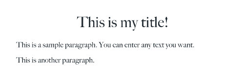
Notice how each content section defines its own properties.
The properties are only applied to the immediately following content and do not carry over.
The size of the paragraphs in the above example is therefore not 30 points, but 15 (the default if the size prop is not defined).
Separate lines in your content will be displayed as separate paragraphs.
You can adjust the spacing between paragraphs using the paragraphSpacing property.
Here’s a list of the available properties you can adjust, and their defaults if they’re not defined in a block:
| Property | Description | Value | Default |
|---|---|---|---|
size |
size of the font | range: 8—600 pt |
15 |
lineHeight |
line height multiplier | range: 0.1—3.0 |
1.2 |
tracking |
horizontal space between characters | range: -10—50 pt |
0 |
paragraphSpacing |
vertical space between paragraphs | range: 0—100 pt |
10 |
firstLineIndent |
horizontal indent of first line of paragraph | range: 0—100 pt |
0 |
columns |
number of vertical columns | range: 1—3 |
1 |
align |
text alignment | natural | left | right | center | justified |
natural |
lineBreak |
wrap text to the next line, or clip on the end | wrap | clip |
wrap |
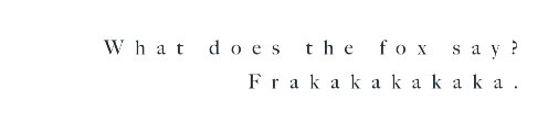
The following example defines every available property:
---
size: 18
lineHeight: 1.4
tracking: 10
paragraphSpacing: 35
firstLineIndent: 20
columns: 1
align: right
---
What does the fox say? Frakakakakaka.
---
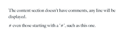
The properties section will skip any line that starts with a ‘#’, so you can use that to add comments to your template:
---
# this is the property section
# with comments
size: 10
# this is another comment
# align: right
---
The content section doesn't have comments, any line will be displayed.
# even those starting with a '#', such as this one.
---
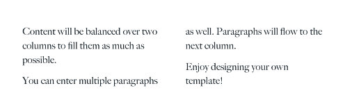
Columns are automatically balanced such that you won’t see large gaps in one column where the text ends early. Each column in a block will have approximately the same height.
---
size: 14
columns: 2
---
Content will be balanced over two columns to fill them as much as possible.
You can enter multiple paragraphs as well. Paragraphs will flow to the next column.
Enjoy designing your own template!
---