Font Appearance
Change how Typeface displays your fonts, to spot differences and to help you discover which font is the right one for the job.
Preview content
Preview any text you want by clicking on the Pr button in the toolbar. You can also press CommandL to quickly summon the preview text input.
The dropdown arrow to the right of the preview input field provides some handy presets such as the Latin alphabet, numbers, symbols and pangrams for multiple languages. The preset will preview each font in its own name.
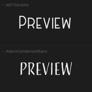
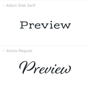
‘Hamburgefonstiv’ is a meaningless word that gives a nice representation of a font due to its variety of characters. This combination of letters shows the most used forms and curves of the alphabet, so it’s particularly useful to see the overall font appearance at a glance.
Choose one of the previews to get a sample specific for each individual font. This shows emoji for the Apple emoji font, Arabic characters for Adobe Arabic and symbols for WingDings. Note that filter will not have any effect if a dynamic preview preset is enabled.
You can right click on a font and use the submenu to quickly change presets, or press and hold on the preview button in the toolbar. Choose to save your own custom text as a new preset.
Preview size & tracking
Change the preview size by pinching with two fingers on your trackpad, or use the slider in the toolbar. To change the tracking (the uniform space between characters) hold down the Option key while pinching or while adjusting the slider. Alternatively click the numbers next to the slider to toggle between the size (blue) and tracking (orange) slider.
Font colors
By default Typeface shows black on white font previews (or white on black if you choose a dark theme). This is the most common way to display typography and gives a lot of contrast to preview the overall shape and character of your fonts.
If you already have a specific color palette in mind for a project or you want to see what a font looks like in low contrast situations you can adjust the preview text and background colors.
Switch to the colors of your choice by choosing > from the main menu, or click on the color wheel button in the Pr preview text panel. A separate color panel will show up allowing you to change the current color. Two circular swatches allow you to switch between text color (top swatch) and background color (bottom swatch). Click on the x button in the color panel to reset both colors.
The app interface subtly adjusts to the colors you pick, to fully immerse yourself in the theme. Interface tinting blends with your current app theme, which can be light or dark. You can disable this feature by unchecking > .
Theme
Typeface comes with a light and dark theme. By default Typeface will follow your current macOS theme. If macOS uses the dark appearance Typeface will be dark too. And the app will switch to light mode when macOS is light.
You can manually change the Typeface theme in . Set the to or and the app will keep that theme regardless of your current macOS system setting. Set the theme to and the app will change colors based on the macOS system appearance.
To quickly switch between dark and light choose > or press OptionN.
The interface colors of dark and light themes are chosen to focus on what matters most: font previews. That means that secondary information such as font names are deliberately dimmed. If you prefer a bit more contrast you can choose one of the two high contrast themes in . This will increase the legibility of font names, buttons and other interface elements.
View options
The following options are available from the menu.
Alignment
Align previews to the left, right or center.
Auto size
Some fonts are naturally larger than others. Because you’ll probably adjust for that in your designs by changing the point size, it makes sense to preview your fonts in approximately the same size as well. The Auto Size setting tries to adjust the size of all previews, such that you can compare them more easily.
Metrics
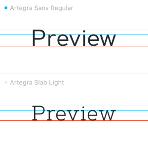
Check the baseline, ascender, descender, cap-height and x-height of your fonts.
Font Smoothing
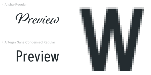
To increase the legibility and sharpness of fonts on screens with smaller resolution a technique called subpixel rendering can be applied. This techniques uses the red, green and blue pixel components of LCD and OLED screens to anti-alias text. It reduces jagged edges. More recent versions of macOS don’t use the individual color pixels anymore, but use greyscale font smoothing improved for Retina displays.
Fonts may appear a bit bolder when font smoothing is enabled. This setting is especially useful for smaller font sizes in body text previews. Note that font smoothing can have a negative effect on certain fonts, for example if there are a lot of small detailed curves.
Outlines
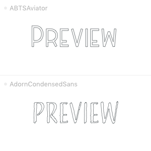
View the glyph curves in detail by showing font outlines.
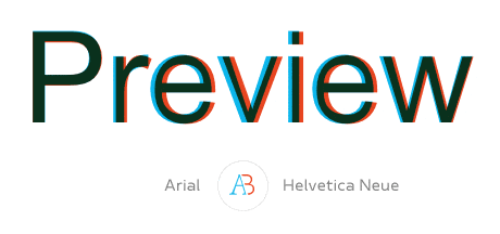
Font compare
Discover every little difference using Font Compare. Right click on a preview and choose to start the compare mode, or choose the AB button on the font detail view.
The compare bar below the toolbar allows you to toggle the overlay AB or stop comparing with x. If you have collected some fonts you can quickly switch comparing between them by clicking the font name in the compare bar.